Primavera Online
Strengthening the brand and improving customer retention by taking ownership of the Enrollment Management system!
This was a multi-month epic, and I was the sole UX Engineer working with a Project Manager and a team of Software developers to create a new Enrollment Management system for StrongMind, a leading Education Technology provider, saving the company $120,000 annually.
After implementing the new enrollment application for returning students in 2024, the student retention rate increased from 46.79% in 2023 to 61.44%, exceeding the initial goal of 56.79% by an additional 5%
We worked closely with our largest client, Primavera Online, throughout the discovery, design, and implementation stages.
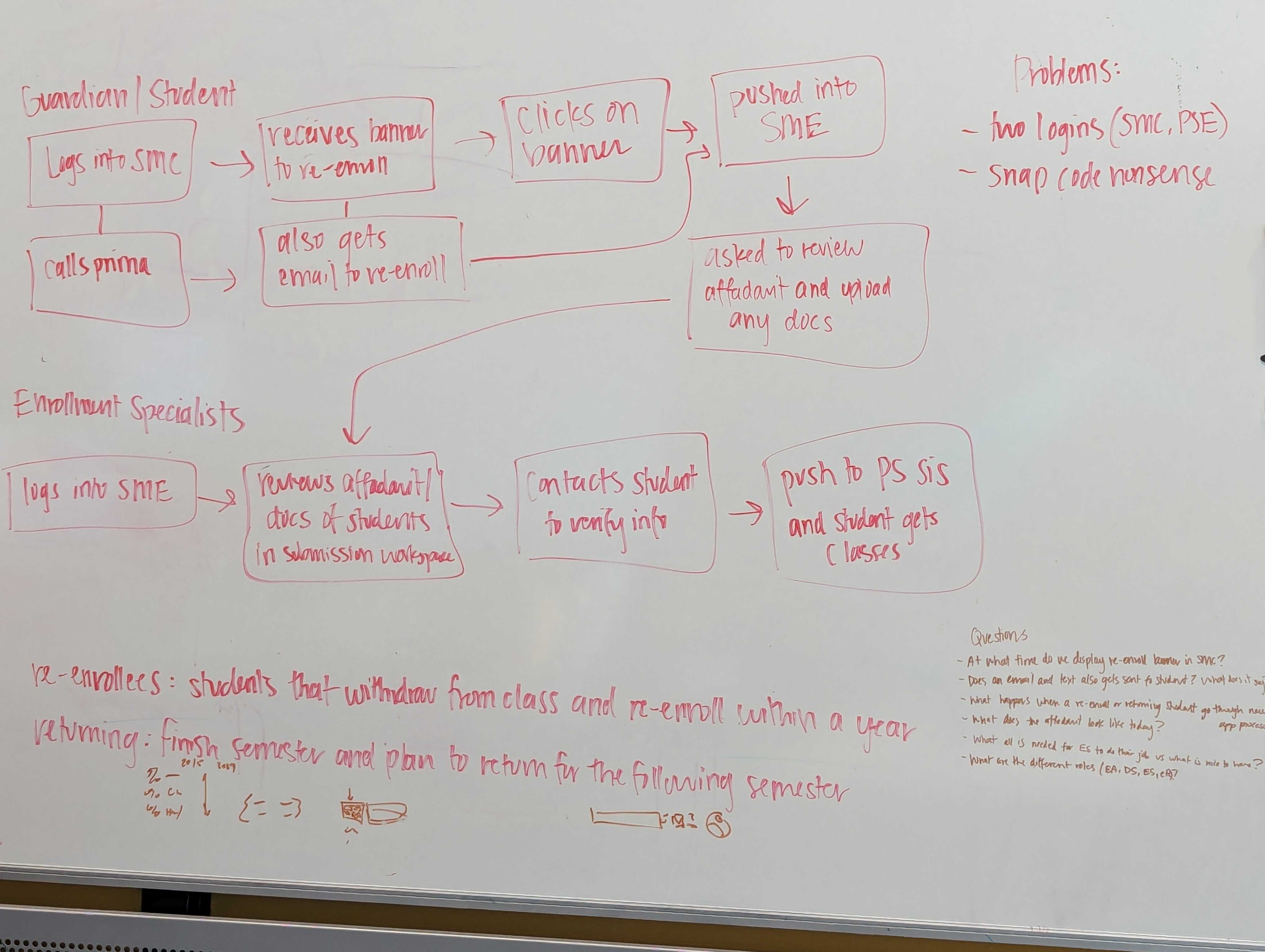
The problem - The main challenge is the cumbersome and inefficient enrollment process for new students/guardians, which creates operational difficulties for enrollment teams at online K-12 schools. The need for account creation, the repetitive task of filling out information, and the overall arduous and time-consuming nature of the application process contribute to the friction experienced by students and guardians in expressing interest and applying.
The premise - The goal is to simplify and enhance the enrollment experience, creating a seamless process for students, guardians, and enrollment teams by directly addressing these pain points.
How does the enrollment experience at our main competitors compare?
Taylor, the Product Owner, and I started with some competitive analysis. We each picked two competing online charter schools in Arizona and went through the online enrollment and registration process recording our findings.
Strengths - What did they do well?- Mobile friendly interface, most information that was on the interest form is pre-filled out in the application
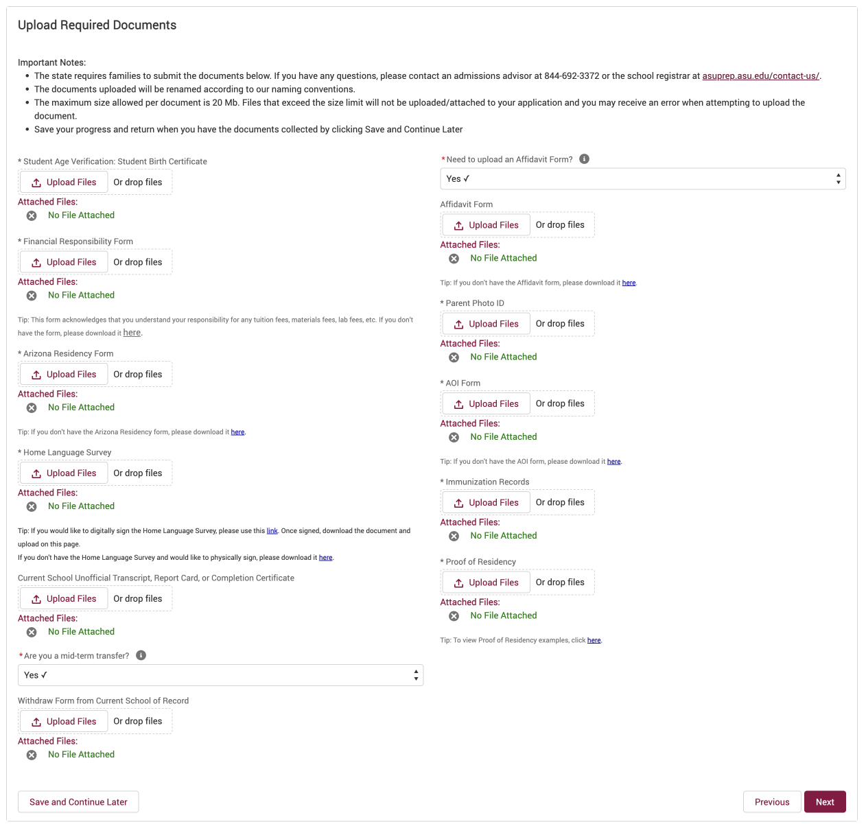
Weaknesses - What did they not do well?- There was no indication of how long the application would be or progress indicators. No setting expectations of the many documents required - After a lengthy process I landed on a page that required the upload of 11 different documents in order to continue!

Ideation
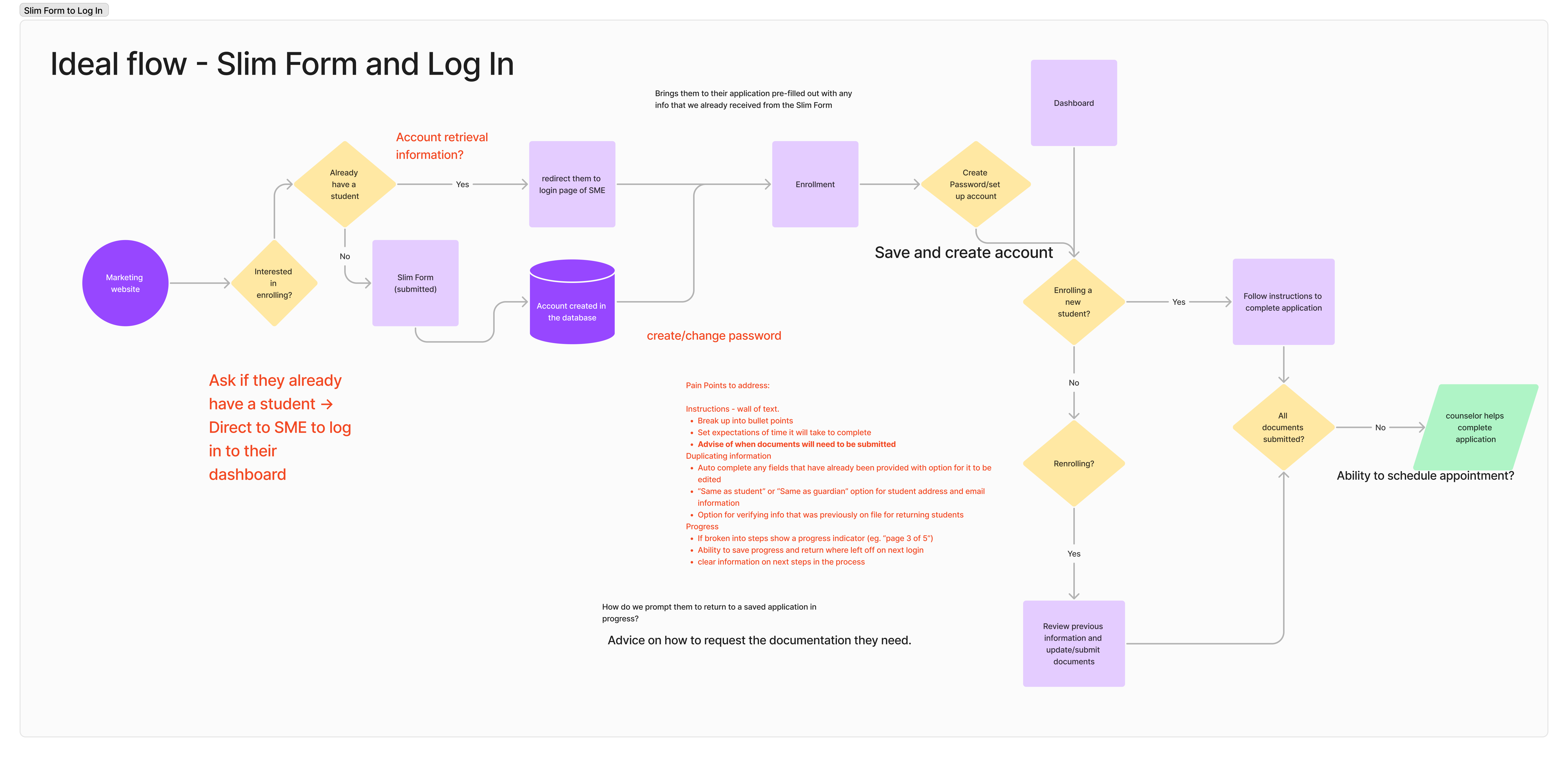
One of the main issues when we began the project was that people were filling out a “slim form”, (which we have since renamed as “interest form”) on the marketing website, and then being directed to a Powerschool application where they would need to create an account and fill out the same information that they just filled out in the interest form.
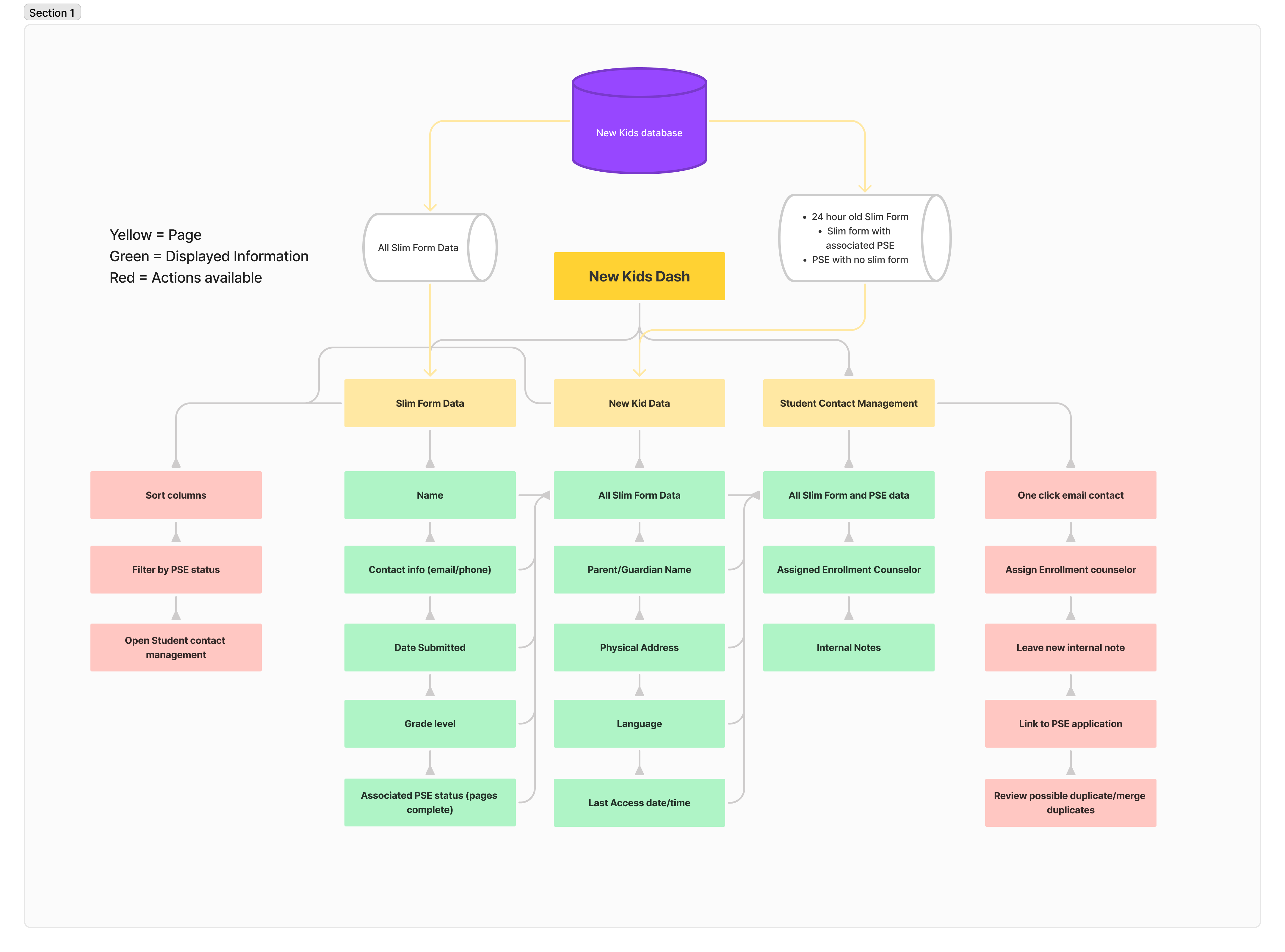
The data from the slim form was collected in a spreadsheet and never heard from again
Sketches and Wireframes
We held a design session with Product owners, Engineers, and Designers to ideate on the UI for the guardian dashboard, where parents would be able to manage in-progress enrollment applications.
We each sketched out our ideas and then used Dot Voting to identify features that we were interested in bringing into our next phase - digital mockups.
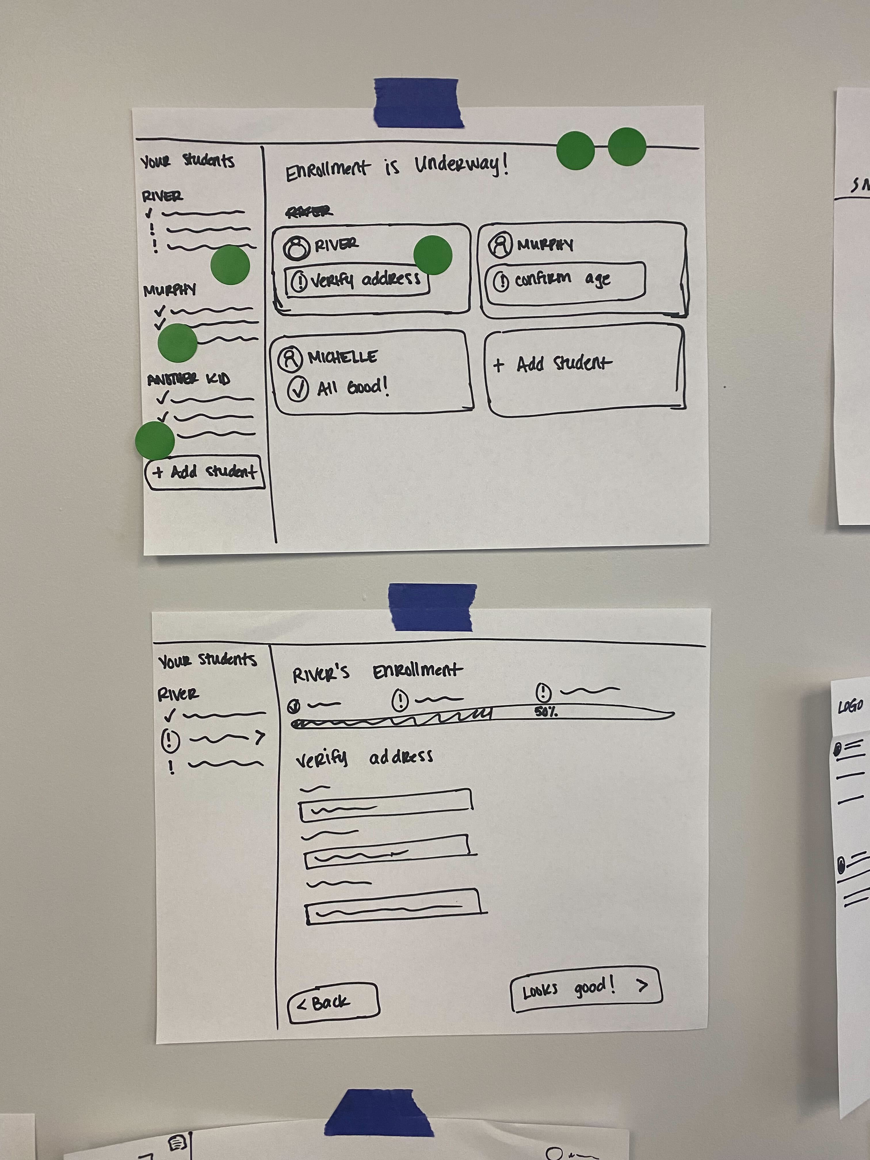
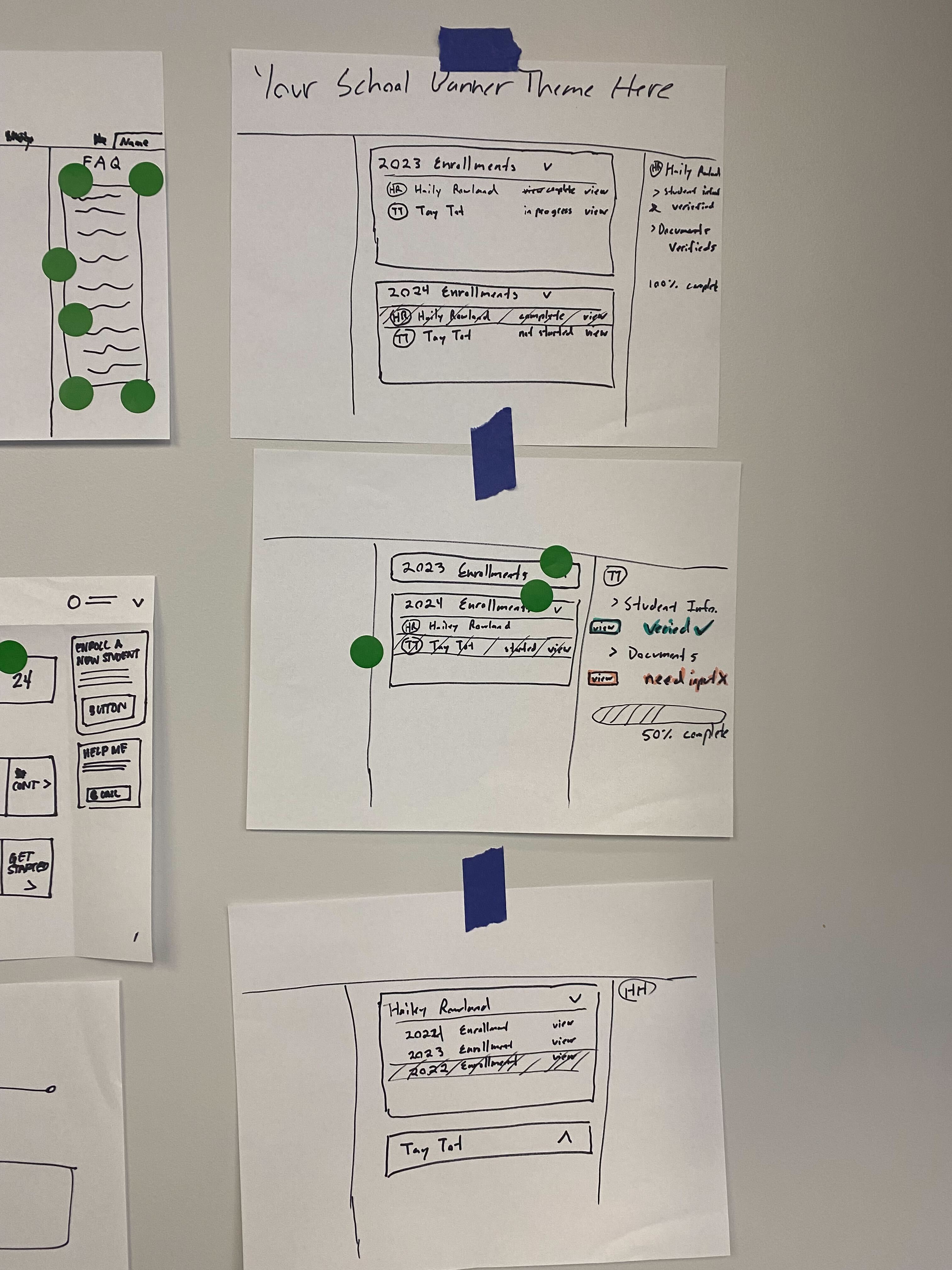
How can we make a good first impression on potential enrollees?
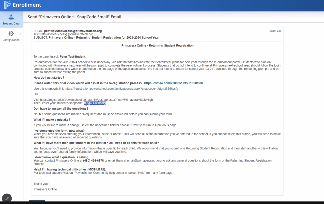
While testing out the current experience for guardians, I completed the slim form myself and received the initial email. I immediately suggested that we redesign the email and sent a quick mockup to the product manager.
The first email had many opportunities for improvement.
- Overwhelming amount of textual information
- Sent from Powerschool rather than the school itself
- No clear action for next steps
- Not mobile friendly
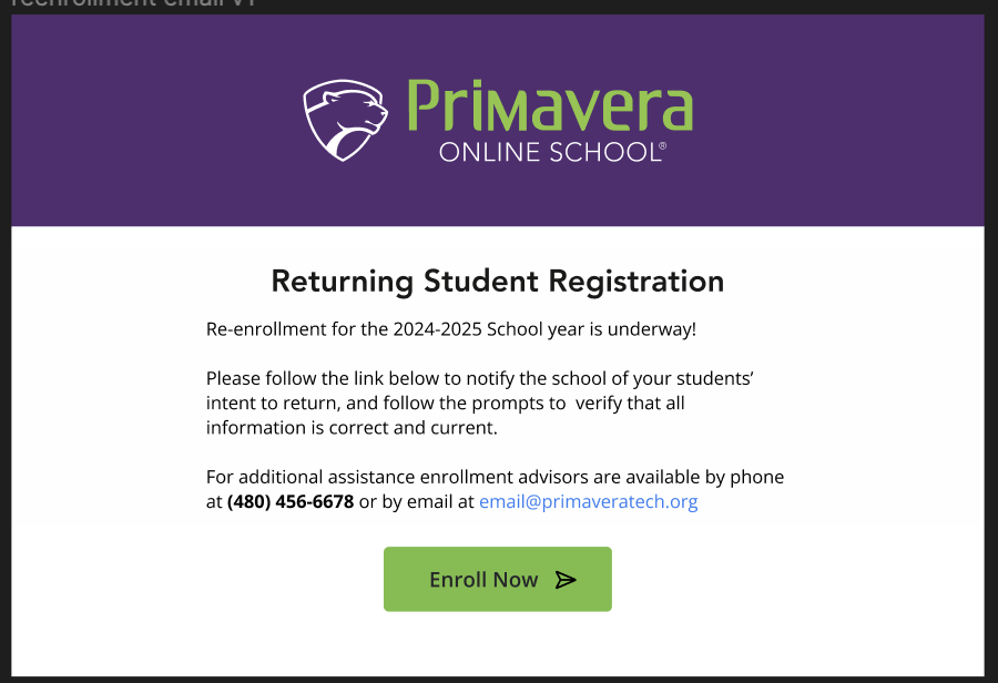
The proposed new design addresses these concerns with:
- Mobile first design
- Branding from the school
- Simple and easy to digest instructions
- Clear call to action
 (1).png)
Rapid Prototyping
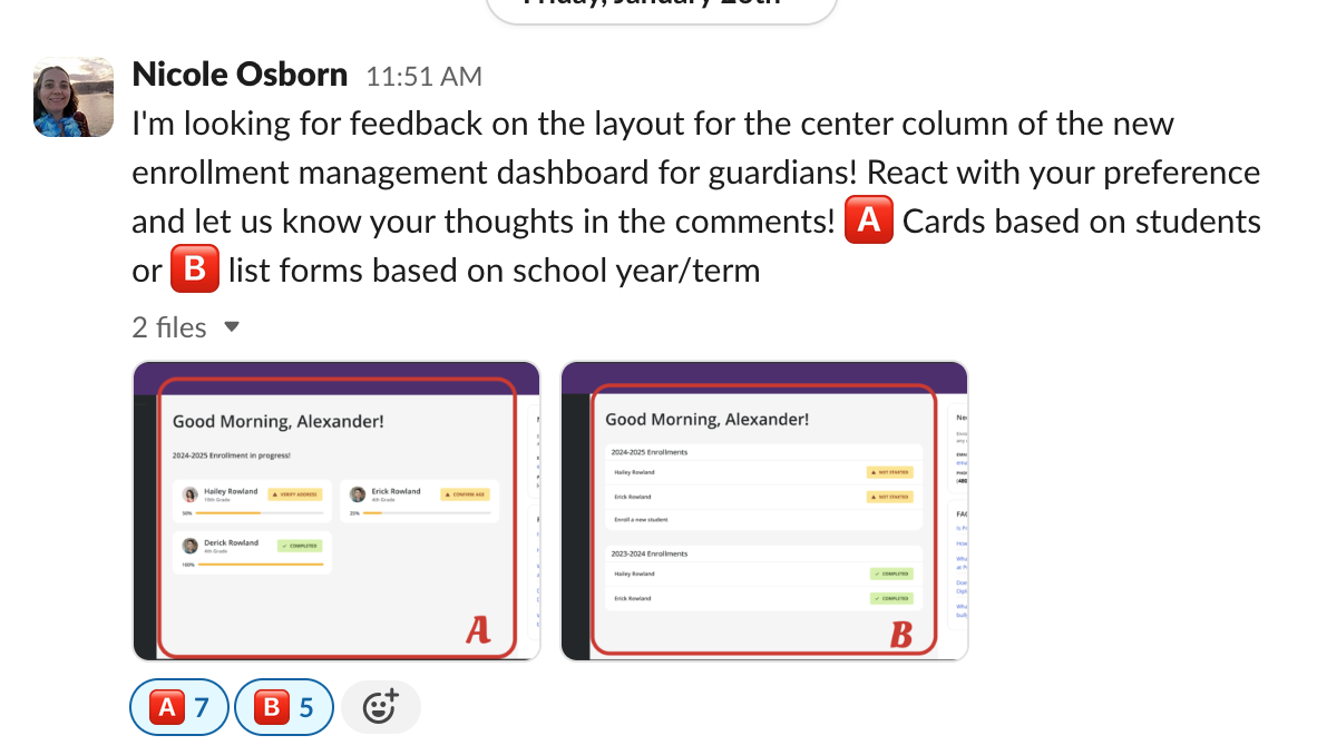
Using the design system components, I was able to create mockups of multiple versions of the guardian Primavera Online and get some quick feedback from stakeholders.
Component Design
Next we began designing the actual pages of the application. I conducted some research on best practices and trends in online forms, making sure to implement the most accessible and usable form components.
Instead of going into the details on input buttons, error states, and disabled fields, for the purpose of this case study, I will focus on an element that we did not already have in our design system - The progress bar!
.png)

I continued to iterate, by including the progress bar on a mockup of an application page, getting feedback as I went from other designers and Product managers.
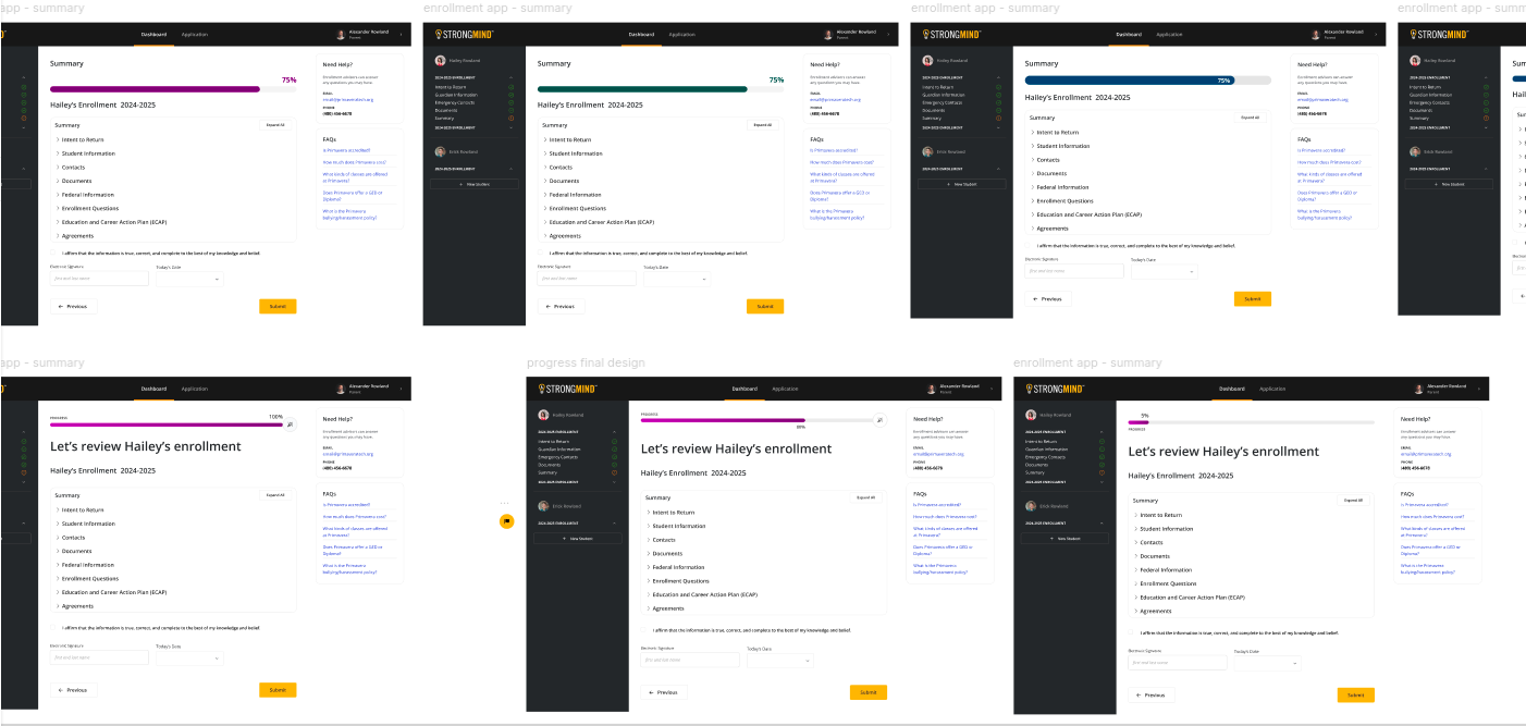
Continous feedback from stakeholders helps to keep end users top of mind.
The Product Owner, Taylor, and I held weekly meetings with various members of the Primavera enrollment team throughout the process of designing both the application and the workspace. Their input into the user’s experience was crucial in ensuring the best design solutions possible within the engineering and time constraints we were given.
Deveopment
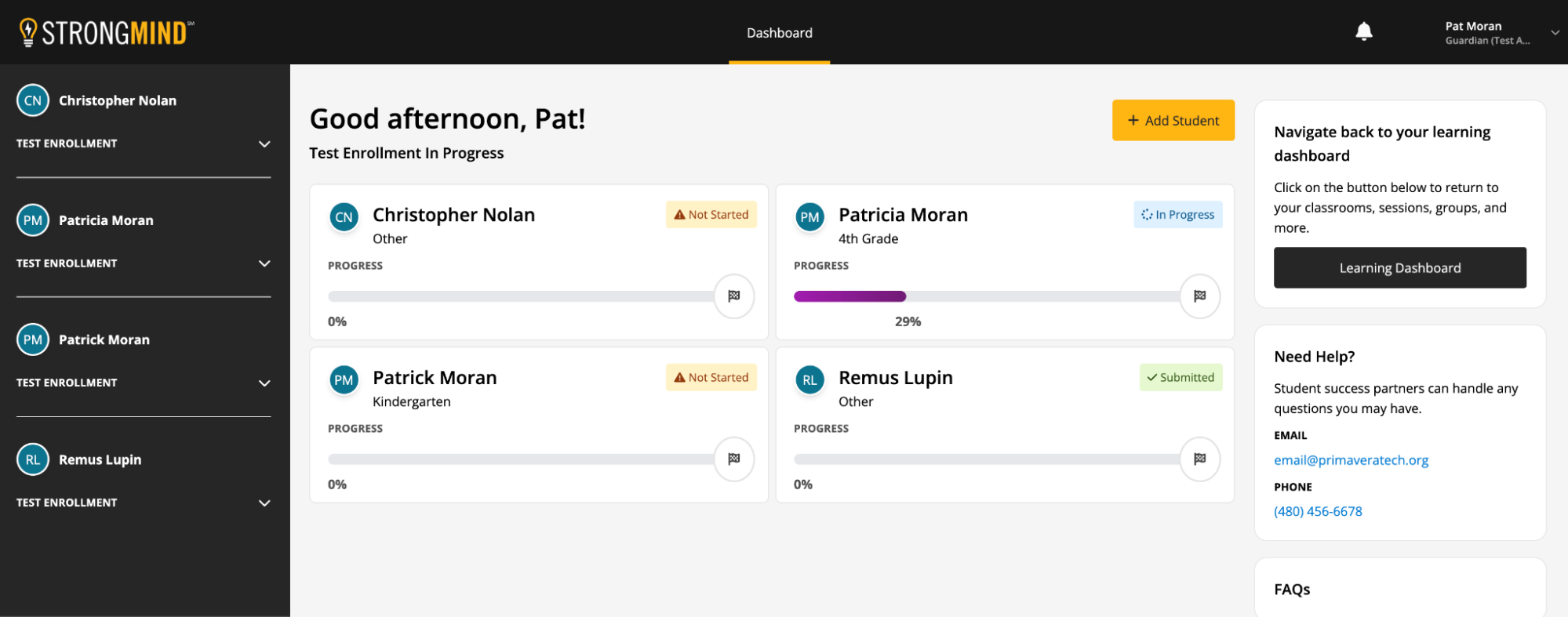
As a UX Engineer, I work directly in the code to build and maintain the design system, as well as working closely with a team of full stack developers as they implement the design.
Continuing Improvements
The application was deployed and we immediately began accepting applications for re-enrolling students. We are currently preparing to implement the application for new enrollments as well and continuing to improve the experience as we go.
One way I’m hoping to make the enrollment process even more enjoyable is by including success messages at a few steps along the journey.
The idea is to tell a story about the application being the beginning of a new adventure of discovery. I held an ideation session to discuss our ideas for how to tell this story.

