openbook
Giving scholars a way to connect with advisors and collaborators, provide peer review, and more!
This was a paid contract position. I worked with openbook founder Jay Gopolan as a solo UX Designer. The UX Design process was one month, after which I worked as a developer, building out the designed components in ReactJS.
The problem - Many scholars in developing nations without a university affiliation are unable to access peer review, advisement, and collaboration on their research.
The premise - Our goal is to create an application that removes those barriers to access, allowing these scholars to improve their academic credentials.
How might we meet the needs of scholars without a university affiliation?
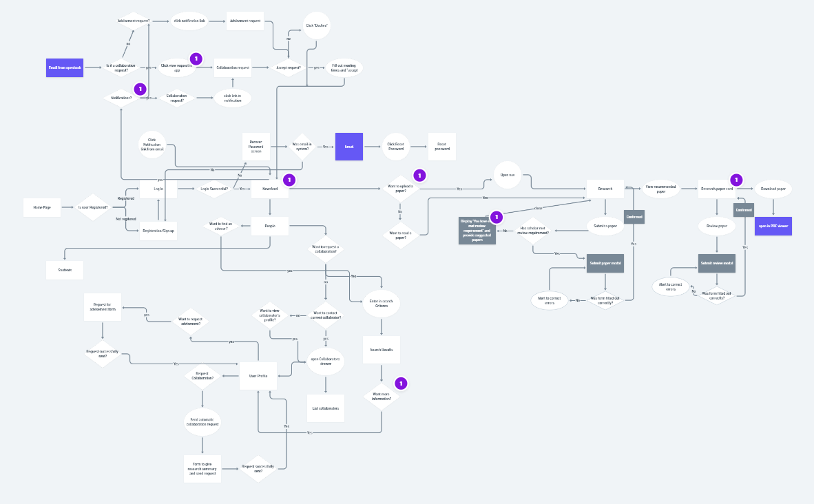
Insights - Based on early research, the target demographic in India and other developing countries most often use their smartphones to access the internet, and they are most likely to use the Android operating system. Based on these findings, we decided to design for mobile first. I began building out a userflow for the mobile app.
Ideation
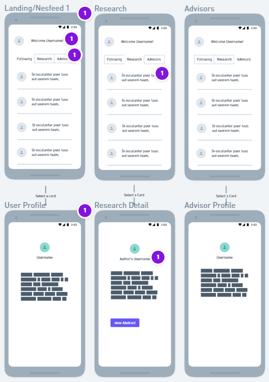
By the end of the first week, I had many iterations of all of the screens that would be needed for the main user flows of the mobile app. I had some questions that I needed user feedback on in order to continue at this point. Jay had a group of stakeholders that he would be willing to send a survey to, so I created a survey to send out on Friday afternoon so that I would be able to evaluate the results on Monday.
Survey results
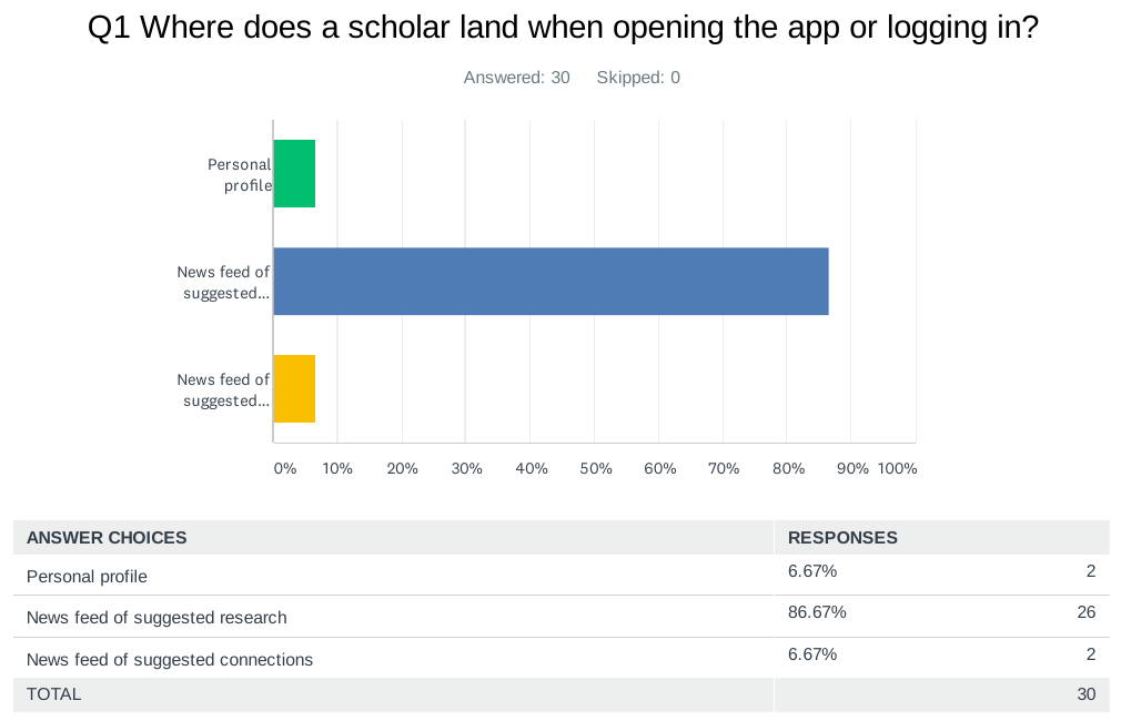
The respondents overwhelmingly felt that the newsfeed of suggested research was the best place to land when opening the app. They also helped make a decision on which term to use for a scholar’s connections to others as an advisor, student, or collaborator. I was surprised by the feedback that tapping on a card for research or for a scholar profile should open up an overlay modal rather than navigate to a new page.
Learning the Brand's Aesthetic
Before beginning to build higher fidelity mockups in Figma, I needed to get familiar with the brand's established style guide. It came with specific instructions on colors, and fonts, and how to use the logo. Other than that, I only had the website to understand the company's brand.
The website used the bluish "neutral" color for a background, and "openbook orange" as an accent color. It also had floating "card" style boxes for information. I used that as inspiration for my first mid-fidelity mockups in Figma.
Unfortunately, Jay felt that the bright and fun tone of the colors I chose did not portray the brand in the way that he wanted. He said that it should feel sophisticated and luxurious and that the dark “mature blue” as the background with the brighter yellow-orange logo better portrays that image. Back to the drawing board!
I changed the colors, keeping the rest of the design, but there were a few things that didn’t seem aesthetically pleasing. The white cards almost hurt the eyes with the very dark background.
So I tried it with the light blue background still behind the cards, but the dark background and logo at top, but the style just didn’t seem to flow.
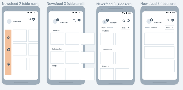
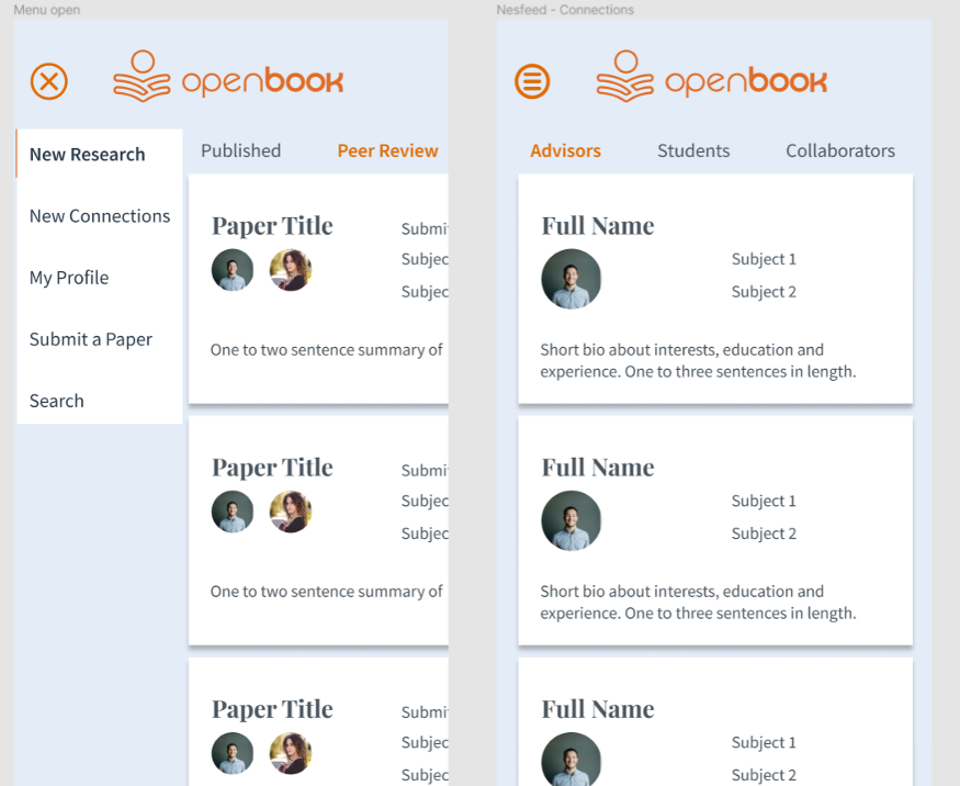
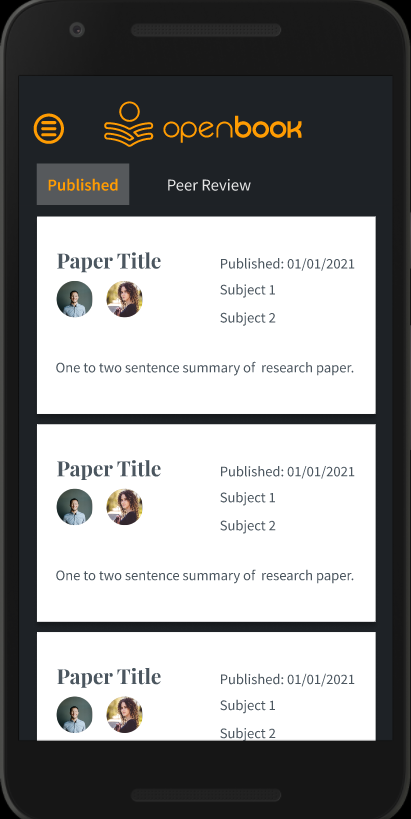
Then, I ditched the idea of the floating cards altogether and went with a more modern style of cards extending across the entire screen, only separated by a gray line. In this iteration, I also tried getting rid of the menu in favor of bottom navigation and icons for the search and profile and settings, with a floating action button for the main action of submitting a paper.
Usability Testing
I recieved approval to create tests on UsabilityHub and order 30 testers for each. I used a first click test to make sure people could navigate the landing page. I also created an A/B preference test to see if users liked my new floating action menu, or if they preferred a traditional drawer menu accessed with a hamburger icon in the top nav bar. Our responses came back within an hour. This was much easier than trying to recruit people to test my products for free, I could get used to this!
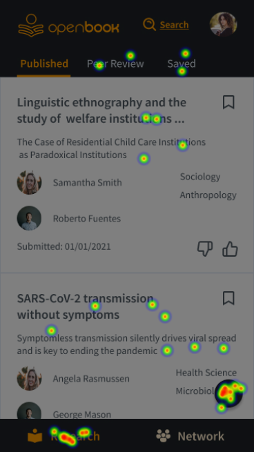
Insights: I felt very confident that my floating action menu was great for mobile phone usability, as it moved the main menu in thumb tapping distance rather than at the top of the screen. It also gives it a fun and modern feel. But, as I will often be reminded, I am not the user. This test of users in our demographic (highly educated people in India) showed a clear preference for the drawer menu. Reasons people gave were that it was simple and clear.
Live Prototype Usability Interviews
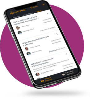
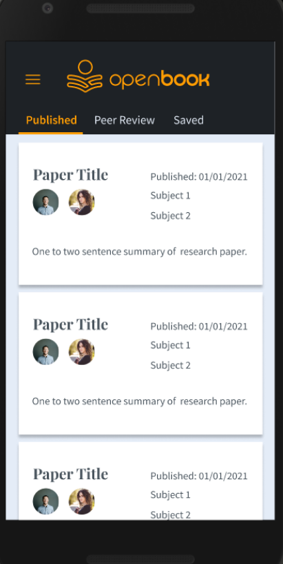
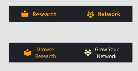
I conducted three live user interviews over Zoom, which allowed me to record the session for later review. During user interviews I found that people had difficulty understanding what the “Research” and “Network” tabs on the bottom navigation really meant. These are news feeds to browse suggested research and connections based on our algorithms. So I changed the labeling to say “Browse Research” and “Grow your Network” to better represent their function.
I received some feedback from new a teammate regarding the thumbs up and thumbs down icons. She felt that it gave it a judgey feel and assumed that it meant “like or dislike”. I realized it didn’t appropriately convey the meaning which is actually “more like this” or “less like this” to help our algorithm in suggesting research or people. So I created three different versions of the cards and had people vote on which they felt gave the correct meaning of the icons. I called them “Social media style”, “Pandora style”, and “Reddit style”.
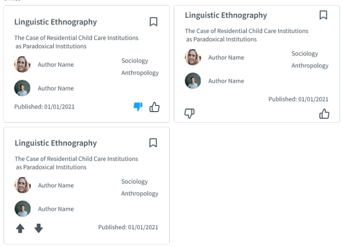
Interestingly, the conversation that followed led to a completely different solution. Instead of any icons, we would have a small menu for each card with clear options of “more like this”, “less like this” and “save for later”.
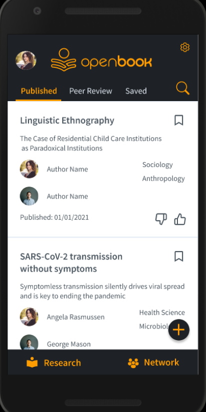
Final Prototype
Reflection
Working for openbook has been an incredible experience! I often felt that I was in over my head as a solo designer on such a large project, but it forced me to learn and improve quickly. At the end of the 4 week internship, I was offered a contract position as UX Engineer, and went on to learn even more new skills as I created a UI component library using Storybook and ReactJS. I am so grateful to Jay, the founder of this startup, for trusting me with such an important part of the creation of this incredible new product!