Lambda Mobile
Allowing students a consistent experience across devices!
This was a school assignment and it was a one month team project. I worked with three other UX designers, Andrew Hagen, Cody Fink, and Andre Orellana.
The premise - Lambda School does not have a mobile student dashboard, making it difficult for students to access their training kit materials or view their grades and progress if they are away from their desktop computer.
The problem - our goal is to create a version of the student dashboard which is optimized for mobile, while providing a consistent experience with the desktop version.
How might we meet the needs of Lambda School students when they are away from their desks?
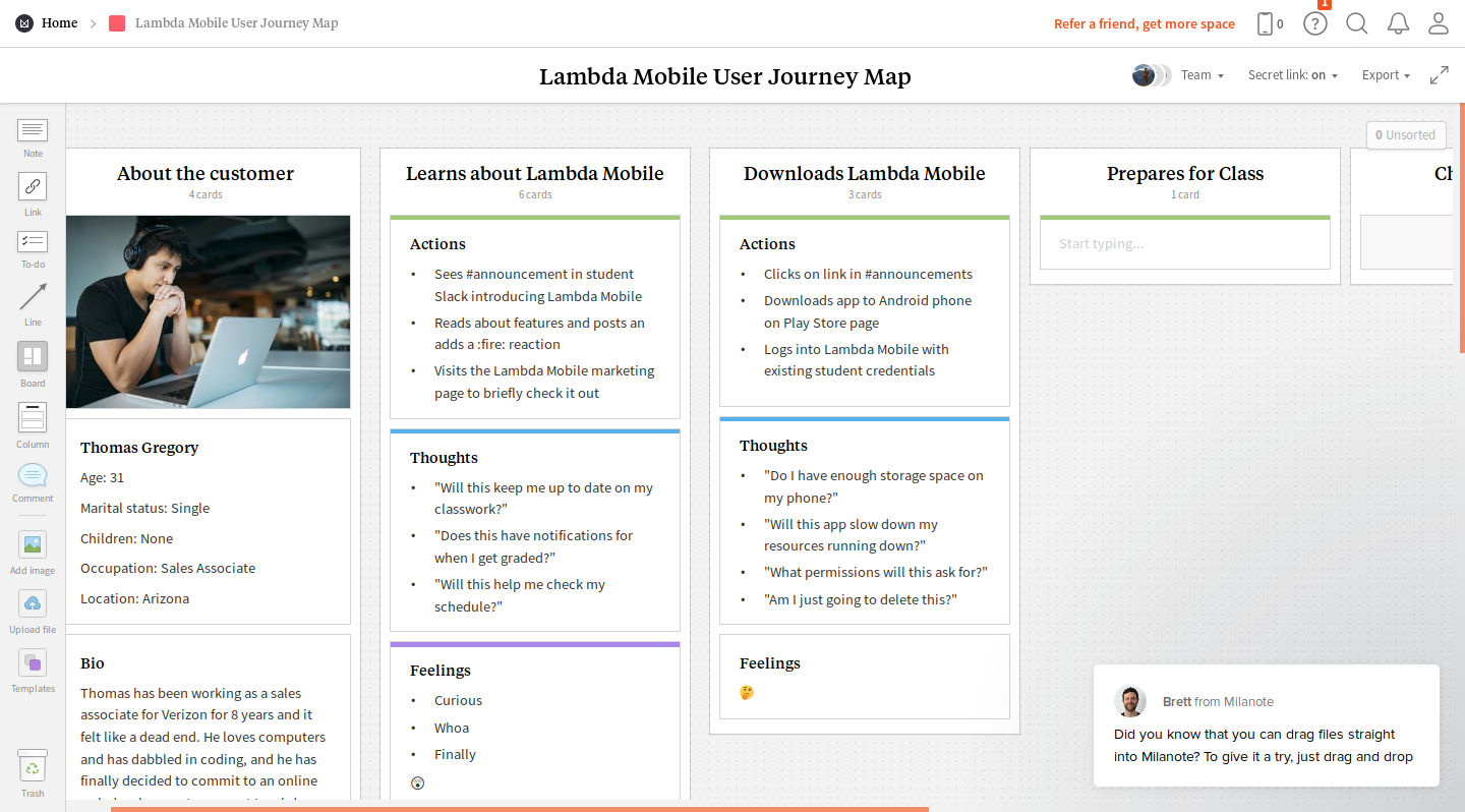
Insights - We wanted to understand which features of the student dashboard are most important to Lambda School students, and how a mobile version would best serve their needs. I set up and conducted an interview with Ben, a student in the Full Stack Web track at Lambda, while a team mate, Cody, interviewed another UX student.
Based on early interviews, students normally only visit the dashboard to view their progress after a Sprint Challenge. The things students would find most useful on a mobile app are:
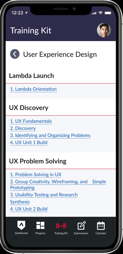
- Access to current Training Kit lesson and materials
- Feedback on the most recent Sprint Challenge
- Staying up to date with the latest announcements
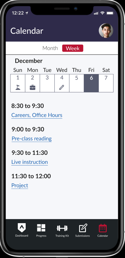
- The shedule for that night's class
Ideation
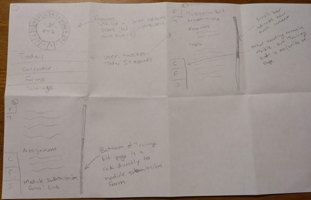
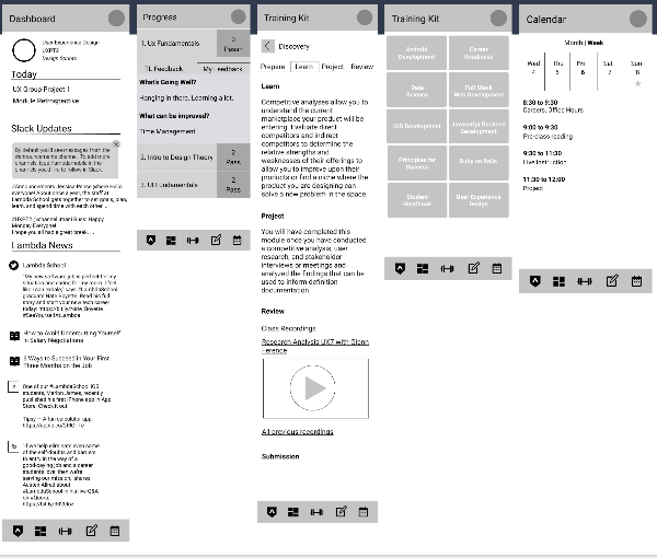
We each contributed sketches for the user interface, and our team lead evaluated them and chose which elements should be included in the next phase of our design. Other elements that were selected included a tiered dashboard with the latest notifications, top and bottom navigation modeled after iOS, and a settings feature to toggle dashboard elements.
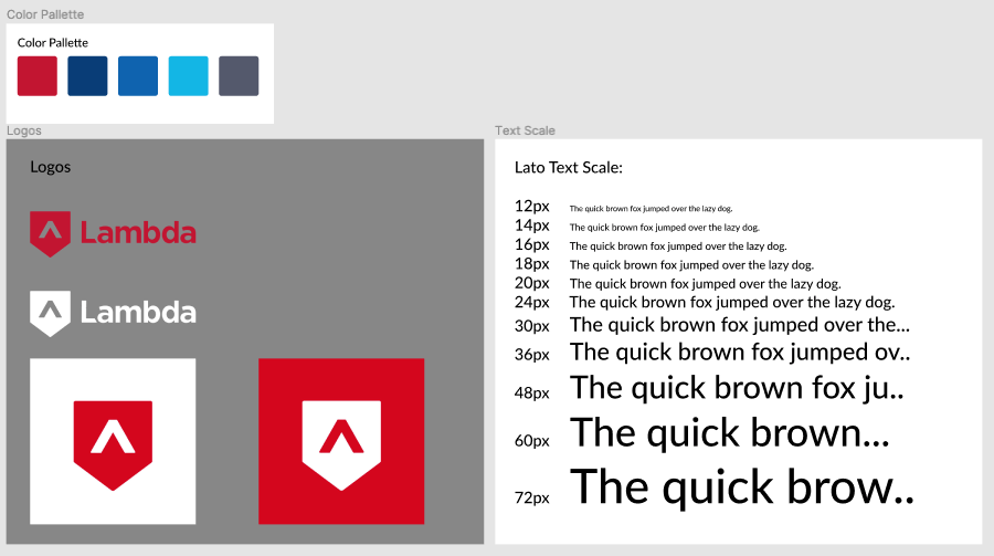
The team decided to assign rolls to help things move smoothly. I chose to be the asset collector. It was my responsibility to collect or create icons, logos, and images, as well as preparing the style guide.
User Testing with Low Fidelity Prototype
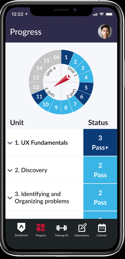
As luck would have it, Cody was planning to attend a local meetup with other Lambda students on the weekend after we completed our wireframes of the design! There were seven other current or past Lambda students at the event, and Cody was able to give a hands-on demonstration using Figma's presentation mode. They approved of the overall design, including the progress circle on the dashboard. They suggested an interactive calendar that would allow students to input their own events an study scheduels.
Oh no! Problems Identified
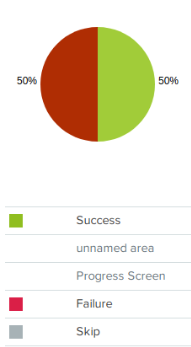
We used Optimal Workshop to create some first click tests, and the results raised some serious red flags! Only 50% of users were able to accurately access grades and feedback or get information about that night's lesson!
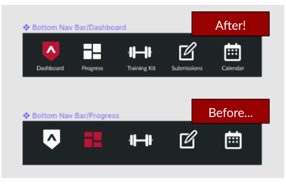
Users had trouble understanding the meanings of the icons on the bottom navigation. I redesigned the icons to include text labels to eliminate confusion. Another problem area was confusion on how to open sections of the dashboard. Andre jumped in here and included toggling arrows.
Verifying Results
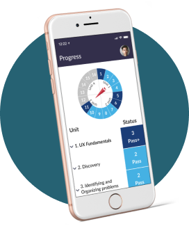
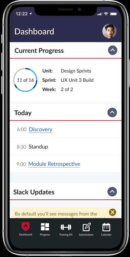
Once we had completed the final iteration, correcting for the issues found in earlier testing, we presented the app to one of the students who had evaluated the wireframe mock-up, and he was impressed! The user appreciated the design, especially the option to turn off social media updates, as he had no interest in those. He liked the progress indicator and was impressed by our bonus feature - adding a dark mode!
Our team lead evaluated our high fidelity mock-up, giving it a big thumbs up! Here is the final product!
Reflection
Working with a team of UX Designers was a great experience! I was amazed at how much we could accomplish by working together to brainstorm and delegating tasks for UI implementation. Creating a mobile version of the Lambda student dashboard was especially engaging, as we could imediately see the value that this could bring to the student experience. Hopefully Lambda will put some of our design insignts to use!